This is effective as the design is bold and also corresponds with the CD design. The contrast in colour is similar to the design for the Japaneese yin yan, which is where i took my inspiration from.

Here is a picture I found on the internet which literally represents my idea of dichotemy:

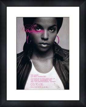
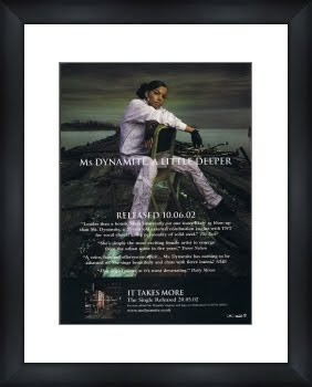
Here are some examples of Ms Dynamite's advert designs. They are similar to my design in the sense that they feature a person or people, however they are different as my design is merely a silhouette of two people and you can't see any features:


FONT:
Font is a another mode used to illustrate genre of music.
As you can see in the first poster

above, Ms Dynamite has decided to go against the conventions of urban music by using very pink and feminine handwriting; the swirls and the italics. Perhaps, like Jay Z, she is trying to make a statement and show the world that she is not all the hard image she puts across, but there is a soft side to her nature that she wants to portray through her music also.
Even though CONTRAST as a duo are two different people, one being softer than the other, I have decided to still convey the urban theme through font by using a bold style. The reason being that many Garage albums I have come across focus on the writing, more than they focus on the image as the example conveys. I don't want to use the same font as this however, to show that there is

something starkly different between the girls, I have decided to use a really basic and blunt font to convey the simplicity of Yin Yan- black and white.
This font is called 'Gunplay' and has a very harsh affect regardless of what it is writing. It gives off an almost military and corporate feel and lacks emotion. I want to use this as it is a deliberate juxtaposition to the emotion in the song. It is also very familiar to jay Z's idea of 'back to basics' which he illustrated in his new album 'The blueprint III' where he used the basic form of human language to write the original form of the number '3'. This was to convey that he was going back to basics and stripping everything down; image and wealth, to convey what he

loves, music.
I really like your advert design Gabi. It looks great, and would be a really good theme to continue with.
ReplyDeleteIf you see any CD covers or adverts that are similiar to this (and I'm sure we can think of some) then you should upload these here to include in your planing to show additional inspiration and reserach.
SJA